In this blog post I will be analysing the typography in psychological thrillers and how I have conducted research into finding fonts for the title of our opening sequence Red.
Typography is the style and appearance of printed matter.
Many psychological thrillers have eye-catching titles that usually stand out more than the actual picture/trailer of the film. We will use this concept to attract our audience and to make sure that they remember the name of our opening sequence due to the use of interesting and eye-catching graphics.
Many psychological thrillers have eye-catching titles that usually stand out more than the actual picture/trailer of the film. We will use this concept to attract our audience and to make sure that they remember the name of our opening sequence due to the use of interesting and eye-catching graphics.
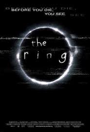 | The Ring (2002) The title for this film is very child-like which matches the plot of the film. The font is very basic but is very eye-catching and easy to remember. This means that people will remember the film if they were to see this title on TV or on any media platform. The simplicity of the title is very effective as it draws the audience and is different to many film titles which are normally bold in terms of size of font and the colours used |
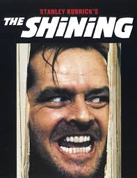 | The Shining (1980) The title for 'The Shining' is very bold yet very minimalistic. It does not use fancy font - which could ruin the effect of the rest of the promotional picture. The title is in white which connotes 'purity', 'good' and 'cleanliness'. However, referring back to the film, the film is not about purity. It is more so about the supernatural world. The title may be misleading to some audience members however, it is very engaging as it is in bold and at the top of the picture. |
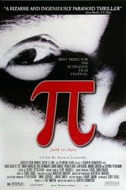 | Pi (1998) As for the 1998 phenomenon Pi, the typography of the title is different to most titles as it uses the symbol for Pi instead of the actual word. This is a different take on titles as some people may not know what this symbol means but may remember the title as it stands out from the poster/promotional picture. It is also in red which is a typical colour used in psychological thrillers - which connotes 'murder', 'evil', 'danger' and 'blood'. |
I experimented with many font websites to find the right font for the title of our opening sequence Red. I experimented with Microsoft word which includes many interesting fonts. Some of them were eye-catching whilst the rest of them did not fit into our genre. I also used a website called 'Dafont.com' which has a variety of different fonts and allows you to search any type of font. I searched up "Thriller" in the search box on the website and found many engaging fonts which could fit with our genre and co-ordinate well with our opening sequence.
Below are some of the fonts that I found eye-catching and relatively suitable for our opening sequence:
Below are some of the fonts that I found eye-catching and relatively suitable for our opening sequence:
 RSS Feed
